Showing posts with label Research. Show all posts

Thursday, 20 March 2014

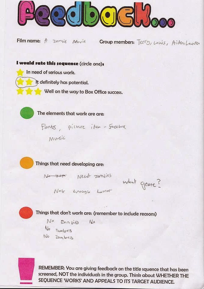
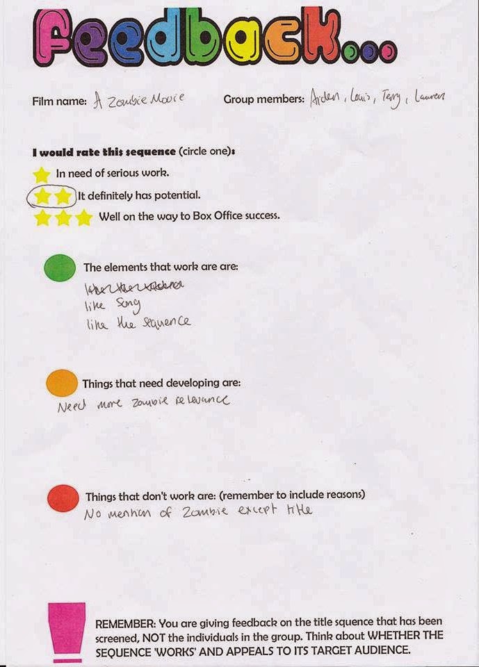
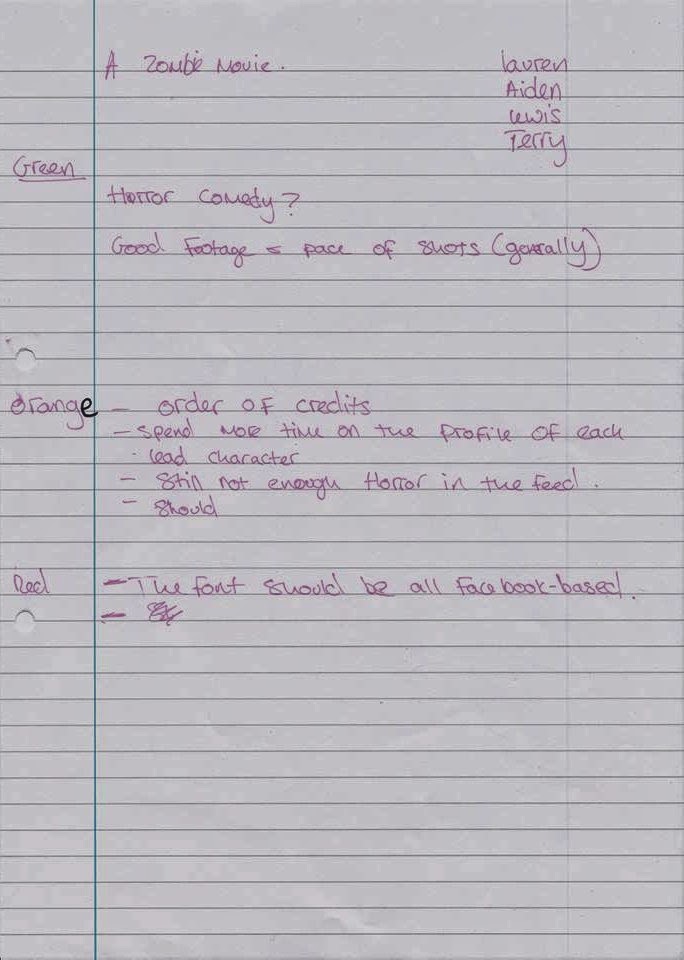
Class feed back from 4th draft


Our feed back wasn't what we quite expected. Most people complained about that there wasn't enough zombies or connotations of zombies. So we will have to put in more connotations of zombies. Another issue was that some people didn't like the soundtrack. Lastly people liked the Facebook but thought it would be better if we put the titles in with the Facebook so it was all linked.


Tuesday, 4 March 2014

Soundtrack research


We have got more music because we thought that our original soundtrack was to popish.

Saturday, 15 February 2014

Principal shoot

We meet up at lozzie around about 11:30 on saturday the 8th of February.

We then went out in the rain to Bostal woods it was very windy but we just took photos of the location which suited our title sequence.


We found a abandoned wear house so we took some shots of it and the area around it.

Wednesday, 5 February 2014

Week 5

During this week we started to look at different fonts in different title sequences. The title sequences we looked at was Catch me if you can, Lord of war and Forrest Gump.

Catch me if you can

. Flows
. Smooth
. Constant movement
. Two fonts represent two key characters
. Serif font
. Sans serif
. Old fashioned
. Government/ serif
. Lines, show that someone is running away
. Both fonts clear and easy to read
. Lines represent saul bass

Lord of war

. Bold and not Bold font
. Hard to notice
 Music is like a trance
. Subtle
. All white
. Soviet writing
. All in caps
. Key characters in the middle

Forest Gump

. Serif
. Old fashioned
. Traditional/ classic
. Old news print
. Slow paced
. Sad
. Steady
. Smooth
. Gentle
. Sense of movement
. Soft/ fade in and back out
. White connote peace
. Central and cant miss it
. Large

Tuesday, 4 February 2014

Fonts

These are the fonts from our questionnaires. This is the most preferred font and the font that we most liked.

This is the first design it is just the plain and a bit boring.


This is the second design. We thought that it would be better to add a shadow because it would create an affect. We added a white shadow but thought it was a bit to simple and comedy.


We then changed the shadow to a darker red. Aiden preferred this one.


The last change we made was the shadow to a dark grey. This is the one that i most liked and so did Terry.

Monday, 27 January 2014

Questionnaire

Overall our audience expect this film to be dark comedy, horror and action. They expect to see death, violence and zombies. They want to see zombies, killing, news footage and an introduction to the film in the title sequence. The sound they want to hear are scrams, zombie noises, gun fire and slow deep music in the title sequence. The low lighting they expect to see is low key and dark lighting. They think the protagonist should be aged from high teenager or to 20 year old. There are 3-2 on the type of font the title should be. 

Monday, 20 January 2014

Saul Bass title sequence


During this title sequence you can see that Saul Bass has used hes iconic design for example he has used basic shapes to create moving images. He has used dots to create on big image. The way he has used numbers could show that there has been more than one of that film. He has also used basic and bold colours which stand out. Some of the patterns he has used look like patterns you would find in a hotel or somewhere fancy. Half way through the title sequence he starts to use cards and slot machine simbolys this could show what the film is about and where it could be set. Throughout the whole title sequence he uses white text on a black/ dark blue background so the text stands out and is easy to read.

Thursday, 16 January 2014

Napoleon Dynamite time line

Time line

00.00.03- Fox searchlight pictures (company)
00.00.10- Paramount pictures (company)
00.00.16- Associated with MTV films
00.00.26- Jon Heder (actor)
00.00.34- Napoleons name comes up
00.00.40- Jon Gries
00.00.48- Aaron Ruell
00.00.57- Efren Ramirez
00.01.05- Tina Majorino
00.01.12- Diedrich Bader
00.01.23- Jouy Weitz (casting)
00.01.31- John Swihant (music)
00.01.39- Jeremy Coon (edited)
00.01.49- Cary Lonenzen (production designer)
00.01.56- Mumn Powell (director of photography)
00.02.04- Jouy Weitz (executive producer)
00.02.13- produced by Jeremy Coon, Chris Wyatt, Sean Covel
00.02.27- written by Jared  Hess, Jerusha Hess
00.02.33- Directed by Jared Hess

Tuesday, 14 January 2014

Napoleon Dynamite 2004 title sequence

Sound

At the start of Napoleon Dynamite there is bird sounds which connote nature. It could represent that Napoleon Dynamite is from the country or a small town. After that the music changes into like country out back music it sounds american. The song is based on school and about school time. This could show where about Napoleon lives and could represent that he is still in education.

Cinematography

Throughout this sequence the only shot that as been used is a close up. There has been a close up of loads of different foods with sauce on them which tell us about the people involved in the film. There is also a close up of a high school card which shows that he is in high school still and it has a picture of Napoleon Dynamite. Lastly there is a close up of a UFO card which can show that he is part of some group and shows us what Napoleon likes eg aliens.

Character

The character Napoleon seems to be a bit geeky. we get this impressions from the close up of the picture of him on his high school card. we also get this impression because of the close up of the alien card that he carrys. The use of food and the sauce could show what Napoleon likes to eat. For example all the food is un healthy and is fatty so it shows what kind of diet he has and because of this diet we can see what he looks like. He has an arty side to him also a wild imagenation due to the fact that we see drawings of old myths. Lastly we can tell that Napoleon is geeky because we see some space books with the libary card in them and it tell us when they have to be back and Napoleon checks them so it shows that he is arganised.
http://www.artofthetitle.com/title/napoleon-dynamite/.

Monday, 13 January 2014

The art of film title design throughout cinema history

It could be argued that typography lost importance in this era of title design. (Quote) I agree with this because back in the Silent era the titles were mostly written cards that would be in black and white. these mostly stood out but now images or animation is put out people don't focus on the lettering as much as they use to.   
The title sequence to seven I quite like because I like the way that it isn't mostly images you have black slide with writting on. The writing in this title isn't just plan it jumps and moves about around the screen and goes bold. This makes you pay attention to the writing as well because you can't help but notice it.

 
The James Bond Title sequence for Dr No by Maurice Binder is a nice and simple title sequence which still gives a good effect. He has used spots for most of the sequence but he was the first to create the most iconic symbol for James Bond which is the famous gun barrel opening. I like the way he has used colour spots because it could show what this Dr No is and the spots act as if they are buttons for a space station or some sort of station.

The fact that the film industry was enormous and it tempted artist it has become better. It gave artist the opportunities to show their graphic side towards film. Since this has happened title sequences have got a lot better and more artistic. A lot of the title sequences are simple and could be made by anyone.


Title sequence for Monsters Inc is very creative. It shows a story its self just with the opening credits. This was better because it became a trade mark for disney films where they always had an animated title sequence with characters which told bait about their background.

http://www.smashingmagazine.com/2010/10/04/the-art-of-the-film-title-throughout-cinema-history/