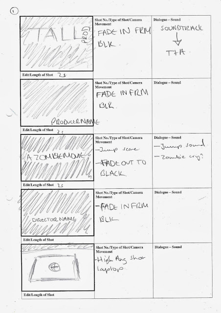
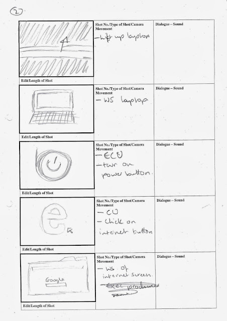
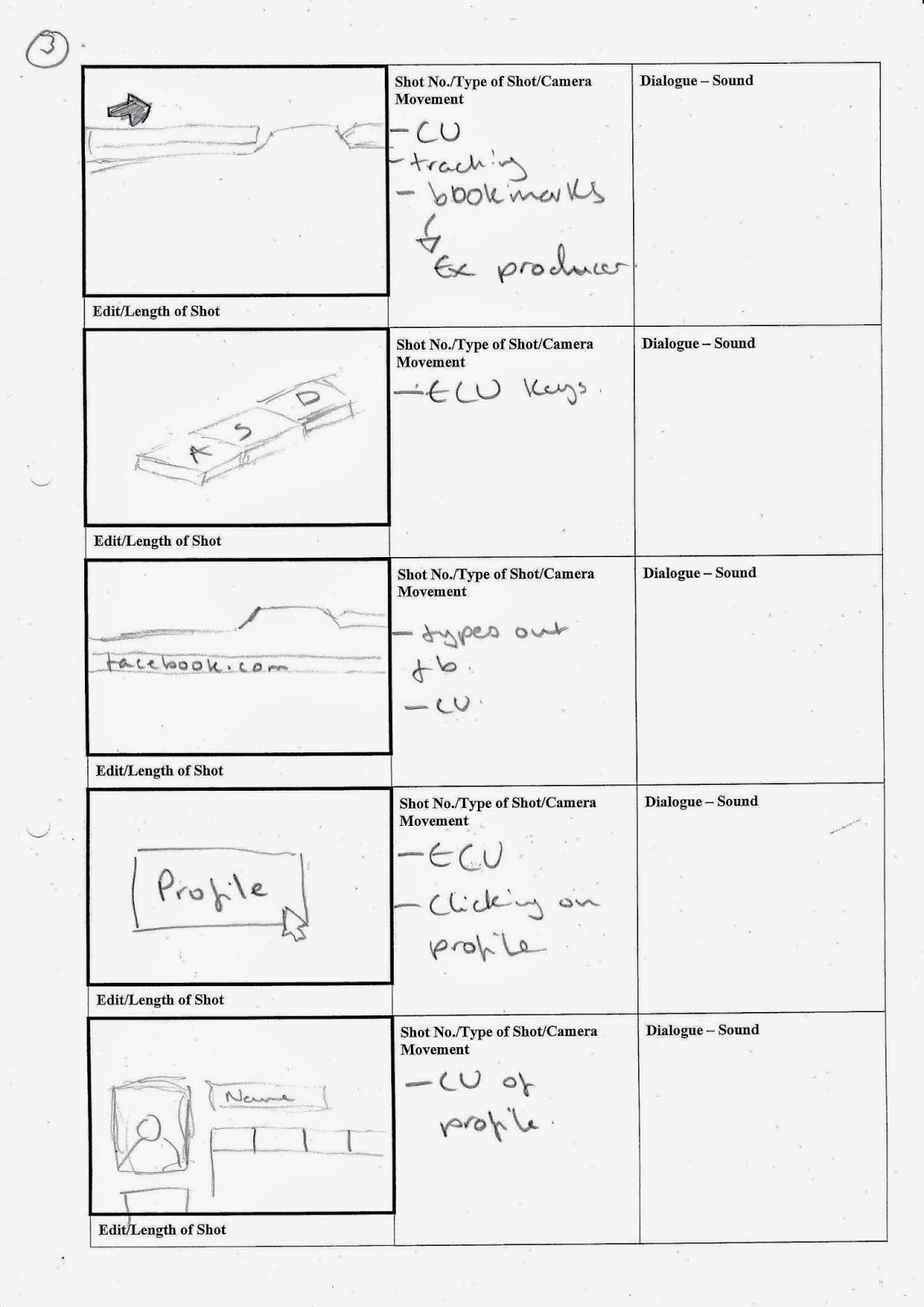
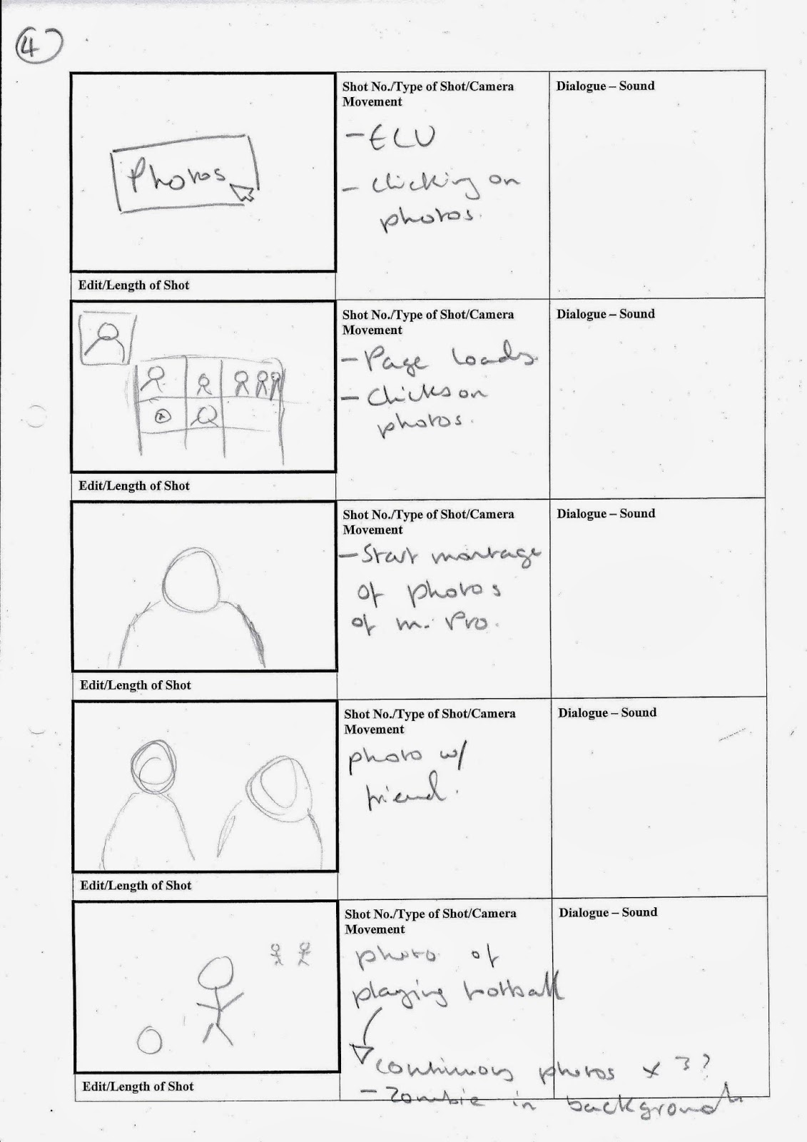
During this week we started to look at different fonts in different title sequences. The title sequences we looked at was Catch me if you can, Lord of war and Forrest Gump.
Catch me if you can
. Flows
. Smooth
. Constant movement
. Two fonts represent two key characters
. Serif font
. Sans serif
. Old fashioned
. Government/ serif
. Lines, show that someone is running away
. Both fonts clear and easy to read
. Lines represent saul bass
Lord of war
. Bold and not Bold font
. Hard to notice
Music is like a trance
. Subtle
. All white
. Soviet writing
. All in caps
. Key characters in the middle
Forest Gump
. Serif
. Old fashioned
. Traditional/ classic
. Old news print
. Slow paced
. Sad
. Steady
. Smooth
. Gentle
. Sense of movement
. Soft/ fade in and back out
. White connote peace
. Central and cant miss it
. Large
Catch me if you can
. Flows
. Smooth
. Constant movement
. Two fonts represent two key characters
. Serif font
. Sans serif
. Old fashioned
. Government/ serif
. Lines, show that someone is running away
. Both fonts clear and easy to read
. Lines represent saul bass
Lord of war
. Bold and not Bold font
. Hard to notice
Music is like a trance
. Subtle
. All white
. Soviet writing
. All in caps
. Key characters in the middle
Forest Gump
. Serif
. Old fashioned
. Traditional/ classic
. Old news print
. Slow paced
. Sad
. Steady
. Smooth
. Gentle
. Sense of movement
. Soft/ fade in and back out
. White connote peace
. Central and cant miss it
. Large